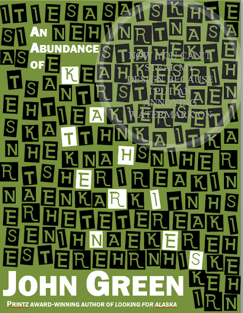
I've never really tried designing things before, so I tried it out and this is what I came up with. I was hoping you could all tell me what I can do to make it better.
One concern I had was the background color - I wasn't sure which to choose. Any ideas?
Also, does the little bit of letters next to his name look weird? Should I cut them out and just put the name across the whole width of the bottom?
The weird circle is my attempt at one of those annoying watermarks, so people can't steal the cover design. PEOPLE. It is illegal to steal this cover!
Also, does the little bit of letters next to his name look weird? Should I cut them out and just put the name across the whole width of the bottom?
 |
| COPYRIGHT 2011 |

Put his whole name across the bottom, like you said.
ReplyDeleteAnd perhaps a blue background?
It's really pretty, though :D
That looks great, I don't have any suggestions.
ReplyDeleteLol @ watermark.
:D
I love the olive green color. And I also think that the letters by the name at the bottom looks cool-- if you were to make his name go all the way across the bottom, it would be too symmetrical and it would lose some charm, I think. ^___^
ReplyDeleteI like this a lot! I feel like a brighter background (such as a lighter green, a yellow, or maybe even an orange) might fit the book a bit better though. Awesome job!
ReplyDelete